Are You Giving Those Who Unsubscribe the Cold Shoulder?
Posted on October 22, 2013
 Is your unsubscribe process in line with your brand? What message does your unsubscribe page and opt-out confirmation page send to your customers?
Too often those who opt out are met with a process that seems uncaring and messaging that conveys indifference and disinterest that sometimes borders on quiet hostility.
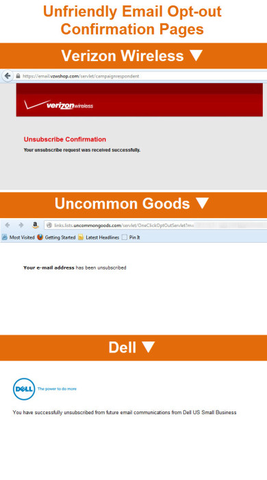
For instance, Verizon Wireless’s opt-out confirmation page is cold and clinical. No “thanks for being a subscriber.” No “sorry to see you go.” No indication that they want to interact or do business with them in the future.
What’s also missing is their usual navigation bar and footer links. There’s just a logo and a brief confirmation message. They don’t try to engage outgoing subscribers with any links at all. It’s a dead end. Landing pages like this suffer from what I call “back alley syndrome,” since it’s like being thrown out the back door of a store into the alley.
Uncommon Goods and Dell’s opt-out confirmation pages suffer similar messaging and design flaws.
In today’s complex, multichannel world, just because an email subscriber opts out, doesn’t mean that their relationship with your brand is over. They may find that other marketing channels are better for them, or may intend to sign up for email again in the future, or now use a different email account for promo emails, or—any number of other reasons that are difficult or impossible to know or control.
Hopefully you’re able to offer topic preference and opt-down options on your unsubscribe page or in your preference center as a way of being responsive to subscriber needs and reducing opt-outs. Fab.com and Jetsetter’s preference centers are great examples of presenting these options.
But when those tactics fail, remember to be gracious on your opt-out confirmation page. Thank them for being a subscriber and say that you hope they’ll re-subscribe in the future. Manners cost you next to nothing and could significantly impact how subscribers perceive your brand.
Also be sure to bring a cross-channel vision to your email opt-out confirmation page by giving folks the option to opt-over to another channel—whether it’s following your brand on Twitter, downloading your mobile app, subscribing to SMS alerts, or signing up to receive for your catalog. Increasing your audience in one or more of your other channels can help compensate for the loss of an email subscriber.
The Changing State of Email Nav Bars
Posted on October 17, 2013
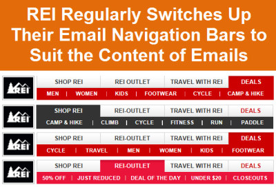 The email navigation bar is evolving. Experimentation over the years has led to greater flexibility, fraying the connection between the links in website nav bars and those in email nav bars. And now the move to mobile-friendly is blowing up that connection completely, and whittling down the number of nav links to the bare necessities.
Mobile Navigation Bars
Back in 2009, I looked at the email nav bars used by major retailers and found that 38% of retailers used an email nav that matched their website’s and that on average they included a little more than 8 links in their email navs. The largest email navs included 19 links, while the smallest only 3.
Those at the low end were ahead of the curve, because…
>> Read the entire post on the ExactTarget Blog
5 Mobile-Aware Email Redesigns
Posted on October 15, 2013
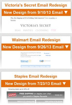 With 48% of emails read on a mobile device, according to Litmus, and 63% of consumers saying they delete emails immediately if they are not optimized for mobile, according to Return Path, there’s a growing imperative to be mobile-friendly. But being mobile-friendly doesn’t necessarily mean moving to responsive email designs.
Depending upon your capabilities and the percentage of your emails opened on mobile, you might find moving to a mobile-aware template a very attractive alternative—at least for the near-term. According to ExactTarget research involving nearly 160 B2C brands, 78% of marketers don’t use either a responsive or mobile-aware template. So at least for now, there’s still a big competitive advantage to adopting mobile-aware email design, although…
>> Read the entire post on the ExactTarget Blog
Infographic: Happy Birthday, Dear Subscriber
Posted on October 10, 2013
Have you ever gotten an unexpected birthday gift? Feels great, right? And you probably ended up giving more time and attention to the gift-giver as a result. That’s the opportunity that triggered birthday emails offer. It’s a winning tactic that generates an outsized return on investment.
ExactTarget research involving more than 180 B2C brands—including retailers, restaurants, manufacturers, travel and hospitality, and nonprofits—shows that there’s plenty of opportunity for brands to delight subscribers with best wishes on their special day. Check out the stats and tactics to learn the who, what, when, why and how of birthday emails.
European Webinar on Email Marketing Best Practices on Oct. 18
Posted on October 9, 2013
 To my European readers: Please join me on Oct. 18 at 11am GMT (London) for a webinar hosted by Smart Insights where I’ll be discussing email marketing best practices and sharing real-world examples of good, great and not-to-great executions.
I’ll answer questions from you and our moderator, Dave Chaffey of Smart Insights, as we talk about…
- The Signup Process
- Welcome Emails
- Defensive Design
- Mobile-Friendliness
- The Unsubscribe Process
>> Register for this free webinar
Also, read Dave Chaffey’s webinar preview and review of my book, Email Marketing Rules.
Mobile-Targeted Design: The Next Step after Mobile-Friendly
Posted on October 8, 2013
 On the sliding scale of mobile-friendliness, most brands are just getting a firm grasp on mobile-optimized email design. As much talk as there is about responsive design, adoption is relatively low in most industries (although next year will be an entirely different story). But as brands plot their jump from mobile-optimized to responsive design, they should keep in mind the next notch in the scale beyond that: mobile-targeted design.
Being mobile-targeted means your email content not only looks different on mobile devices than it does on desktops, the content itself is different…
>> Read my entire Email Insider column on MediaPost.com
Sept. 2013 B2C Email Volume Mixed: Retailers Sent 16.4 per Subscriber, Non-Retailers 6.1
Posted on October 3, 2013
 During September, retailers sent each of their subscribers 16.4 promotional emails on average, up 1% from August. Non-retailers sent 6.1 promotional emails on average, down 1% from August.
This data is based on the anonymous tracking for more than 150 B2C brands, including retailers, restaurants, manufacturers, travel and hospitality, political groups, and nonprofits.
For more on seasonal email marketing trends, check out the Email Marketing Holiday Calendar and this month’s update on the ExactTarget Blog…
>>Email Marketing Holiday Calendar 2013: September Review & October Preview
The Last Word on September 2013
Posted on October 2, 2013
 A roundup of articles, posts, tweets and emails you might have missed last month…
Must-read articles, posts & whitepapers
The Email Subscriber Experience 2008 – 2013 (Return Path)
The Dangerous Tension Between CMOs and CIOs (Harvard Business Review)
10 More Habits Of Highly Ineffective Email Marketers (MediaPost)
The How-To Guide to Responsive Email Design [Infographic] (Litmus)
Responsive email design: 10 great examples (Econsultancy)
How to add a fixed-position CTA to your email newsletters (Campaign Monitor)
Insightful & entertaining tweets
@jacaldwell: platforms aren’t in silos, people are
@wac_intosh: Embrace showrooming by using it as an opportunity to trigger campaigns based on in-store browse. Some retailers over 100x ROI #MKTGwebcast
@iamelliot: ugh, searched “responsive email” on twitter..conjecture, whinging and marketing BS all over the place now. put me right off my Angel Delight
@emailrocks: @chadswhite Thanks Chad! i’ve posted the Performance Driven Marketers Oath here http://t.co/dGVlprp3uM
@EmailKarma: Shocker! Didn’t see this coming from miles away > Yahoo Recycled Emails: Users Find Security Surprises: http://t.co/Dc1ddcpldC #privacy
Also check out: Most Tweetable Tweets from Connections 2013
Great additions to the Email Swipe File pinboard
Priceline.com email sent on 8/23/13 >> View the pin
Helzberg Diamonds email sent on 8/17/11 >> View the pin
Clinique email sent on 8/22/13 >> View the pin
Oroton email sent on 8/29/13 >> View the pin
Noteworthy subject lines
Hayneedle, 9/30 — A Home Made … guest-ready! First in a series of holiday hosting help – with $90 OFF! Plus Styleboards & more …
PersonalizationMall.com, 9/27 — 40% Off Christmas Cards – Order Early & Save
Peet’s Coffee & Tea, 9/30 — Order Holiday Blend 2013 by Tomorrow + FREE SHIPPING
Hanna Andersson, 9/23 — NEW holiday arrivals + the big Dress & Sweater Sale is here!
Michael’s, 9/26 — Now’s the Time for DIY Holiday Décor
Pier 1 Imports, 9/16 — We’re looking for great talent to join our holiday team.
Horchow, 9/16 — NEW for Christmas: 4 Holiday Collections
Walmart, 9/19 — Get more Halloween for your money
Pier 1 Imports, 9/19 — Don’t be scared to get your Halloween decorations now.
Target, 9/30 — Cyber Monday in September? Oh, yeah.
Under Armour, 9/24 — Go Pink Or Go Home.
NFLshop, 9/29 — Your Patriots Are 4-0! Plus, Free Shipping on All Patriots Gear
NFLshop, 9/7 — Gear Up Patriots Fans! PATRIOTS VS BILLS, Sun. 1PM + Every Order Ships Free!
SkyMall, 9/12 — Parking Lot Party! Save on Tailgate Essentials at SkyMall
Walmart, 9/12 — Make a play for game day savings
eBags, 9/29 — Celebrate National Get Organized Week With 25% OFF 1 Item + an Extra Treat Just for You!
Zappos, 9/5 — Sandal season is officially over…
Gap, 9/30 — The first fall chill is coming…
Crate & Barrel, 9/24 — It’s time. Outdoor furniture covers are now available.
Clinique, 9/26 — The “it” shade for fall—get it now!
Lululemon, 9/17 — try doing “it” everyday
The Container Store, 9/25 — Bloggers Love our Home Collection by 3M
Lenovo, 9/29 — The World’s Smallest Desktop
WebMD, 9/20 — The Scoop on Poop
Sephora, 9/13 — We’re bringing sets-y back
Beachbody, 9/10 — Do Vegetarians Live Longer?
Threadless, 9/12 — Wisconsin is made of cheese, and other facts…
St. Jude Children’s Research Hospital, 9/13 — What if your child had 36 hours to live?
ModCloth, 9/5 — Pug + #selfie = best email ever.
Jeep, 9/5 — ●|||||||● Your Jeep newsletter is here.
Most popular posts on EmailMarketingRules.com last month
1. The Many Uses (and 2 Drawbacks) of Animated Gifs
2. Case in Point: Why You Should Audit Your Signup Process
3. The One-Two Punch of Subject Lines and Preheaders
4. Most Tweetable Tweets from Connections 2013
5. Sending a Welcome Series Is the New Onboarding Differentiator
Most Tweetable Tweets from Connections 2013
Posted on September 23, 2013
 ExactTarget Connections was awesome! Beyond meeting tons of great people, old friends and new, there was lots of great content that kept me busy tweeting for four days straight. We’ve already shared 100 Tweets About Leadership and the Power to Lead from Within and Josh Kimber shared the 25 Top Tweets from #ET13, but I wanted to highlight some of the tidbits that I thought were critical.
Before I do that, if you were one of the more than 1,000 people who got a free copy of my book, Email Marketing Rules, during Connections, it would be awesome if you would sent a tweet of thanks to @ExactTarget, which made the giveaways possible. Thanks and I hope to see you at Dreamforce in November and at Connections 2014.
EMAIL MARKETING
@HauteLook sends 200 different email campaigns each month. #ET13
MOBILE
50%-62% of CareerBuilder’s email opens are on mobile devices. #ET13
SOCIAL MEDIA
Warby Parker’s social media team responds to EVERY tweet, Facebook comment, and Instagram. #ET13
I’m impressed 🙂 “@WarbyParker: @chadswhite Yes we do! We hope you’re enjoying Kristin at #et13.”
Nordstrom is highlighting top-pinned items in their stores. -Steve Patrizi, Pinterest #ET13
BIG DATA & CROSS-CHANNEL
Sony communicates with their customers via 30 different channels. #ET13
The pinch point in marketing is generally content. – @mostew #ET13
LEADERSHIP
Real discipline is not what you chose to do but what you chose not to do. -Jim Collins #ET13
“Great leaders build companies that do not need them.” -Jim Collins #BuilttoLast #ET13
“Smart people are a dime a dozen. What matters is imagination.” -Walter Isaacson #ET13
 Email Marketing Rules
